The 5 informations every figure caption should have
Table of Contents
Each time I receive a 10 pages document explaining a scientific work on our data with several figures, my first reflex is to scroll and look at all the pictures without reading any text. This is no different from not reading the manual when you buy a new phone: we are smart enough to understand.

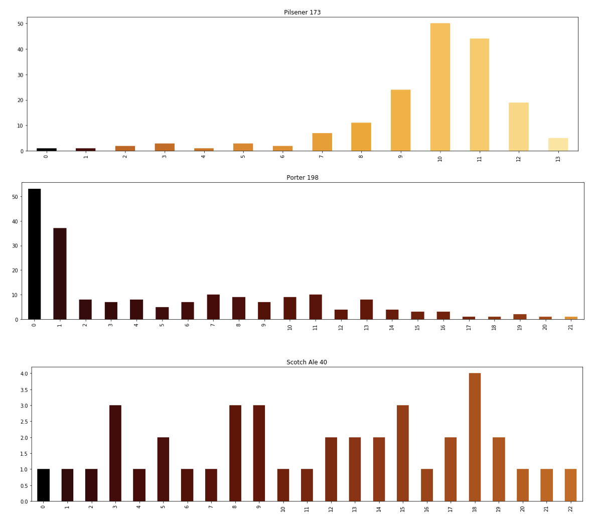
This is for sure the number of beers of each type produced each year since 2000.
Of course afterward, I read the text carefully and realize how wrong I was. Even sometimes I’m not sure anymore of what really shows this figure. So you can imagine that when this remarkable result is transferred to a presentation, its real meaning is definitely lost.
I believe that figures in a document must be self-explaining and engaging:
- Anyone should be able to understand them without reading the rest of the text.
- Anyone should be able to understand why you are showing this.
- The description must lead us to want to know more by reading the surrounding text.
To achieve that, here is the checklist of 5 elements I tend to put in every figure (We are now sharing figures on computers, it’s not a problem anymore to have a 10 lines description).
- Factual description. What are the different elements presented? what are the axes? what are the color for? etc.
This figure shows the number of beer brand depending on their color for three different kinds of beers: Pilsner (on top), Porter (middle) and Scotch Ale (on the bottom). The data is computed thanks to brewerydb. The y-axis corresponds to the number beer brand of a given color. The x-axis corresponds to the different colors (represented by their SRM color) and the color correspond to the color of the beer.
- An example on how to read the figure. Even with the factual description, it can be hard to understand how to read a chart so an example will help.
For example, for a Pilsner with an SRM color of 10, the database count 50 different brands.
- Why this figure is significant, what we can see? If you are showing a picture, it’s because you consider it’s worth noticing. So develop your point of view, tell us what you interpret in this figure.
Comparing these three kinds of beers we can see that the primary color of each type is very different: the average SRM of Pilsner is 10, the one of Porter is 0, and the one of Scotch Ale is distributed between 0 and 22. Also, Scotch Ale is distributed between 0 and 22.
- Your interpretation. Here we want your opinion on the figure. You produced it, so you probably have your own idea of what to interpret.
This figure was created to test if with only the color of a beer we can determine its kind how different beer colors can be. We can see that some types like Pilsner can be associated with an exact color. Others, like Scotch Ale, are way more difficult to interpret only a given color.
- Your questionings. This part is optional. Most of the time a good figure brings the next questions, and the end of the description is the excellent place to place them.
As the color does not seem enough to interpret the kind of beer, it could be interesting to explore the color versus the BMI of the beer.
beyond the caption #
This is only about the caption, the way you present your data is as important and can bring a lot of misunderstandings. But since we never stop producing figures when we work on data, ensuring good captions is an efficient way to ensure that everyone looking at your document got your point.
What are your good practices about figures caption?